捷思版權
JS Agency
捷思版權專注於跨越國界將優秀的書籍輸出或引進不同國家 ,企圖將華⽂類型作品以更多元的朝向國際 IP 化發展,不僅僅局限於出版,還包括改編成有聲書、動畫、漫畫、影視等形式。品牌定位在於不斷挑戰傳統框架,充滿彈性與創新思維。
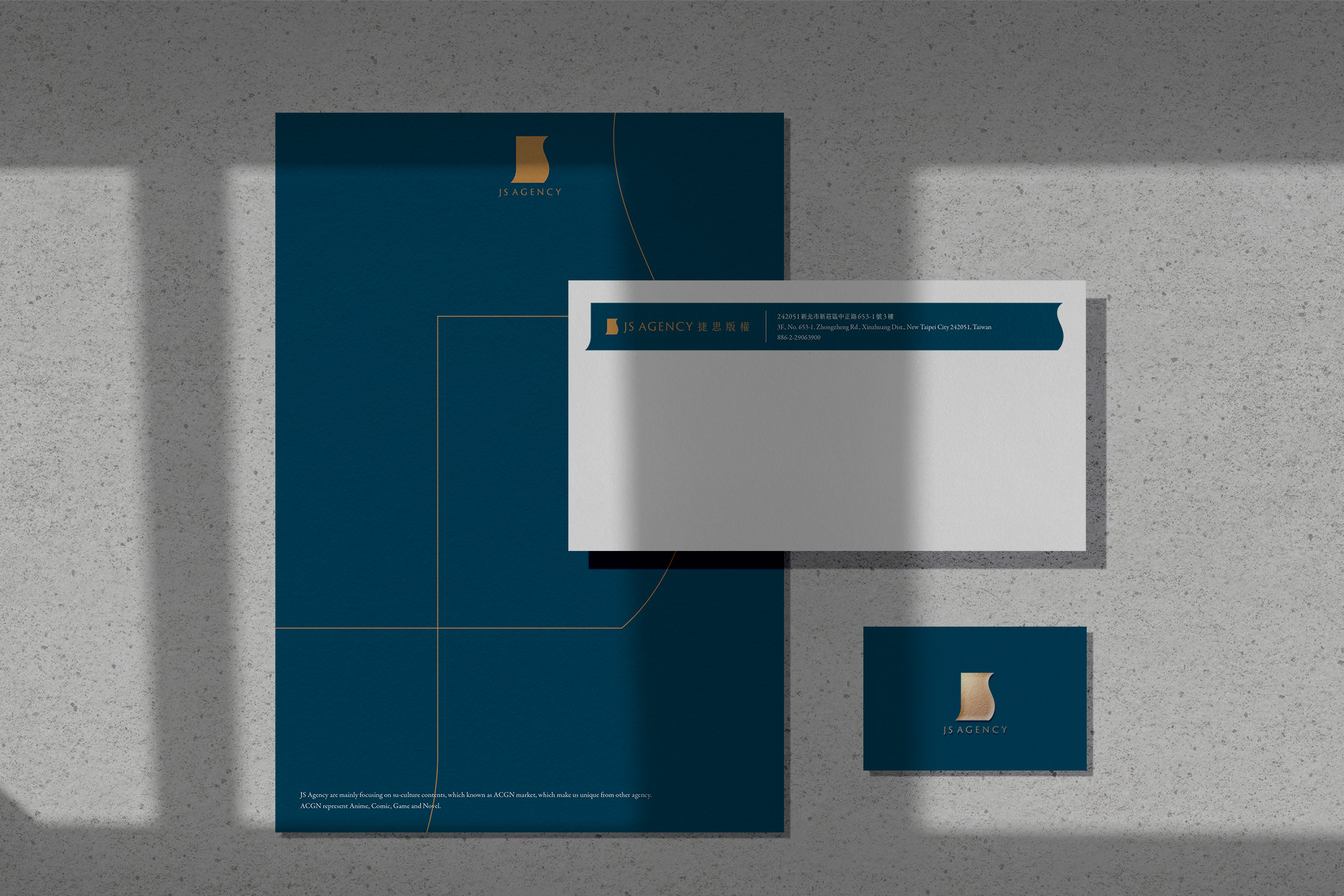
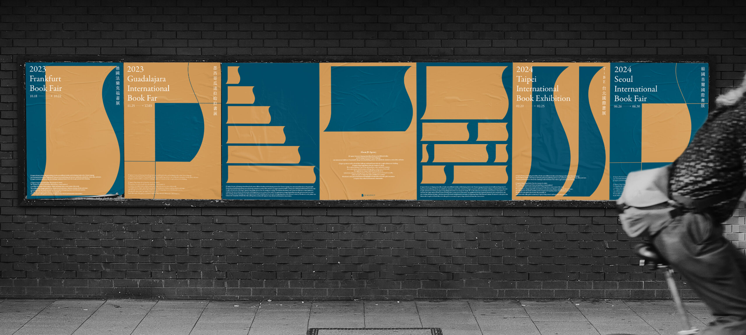
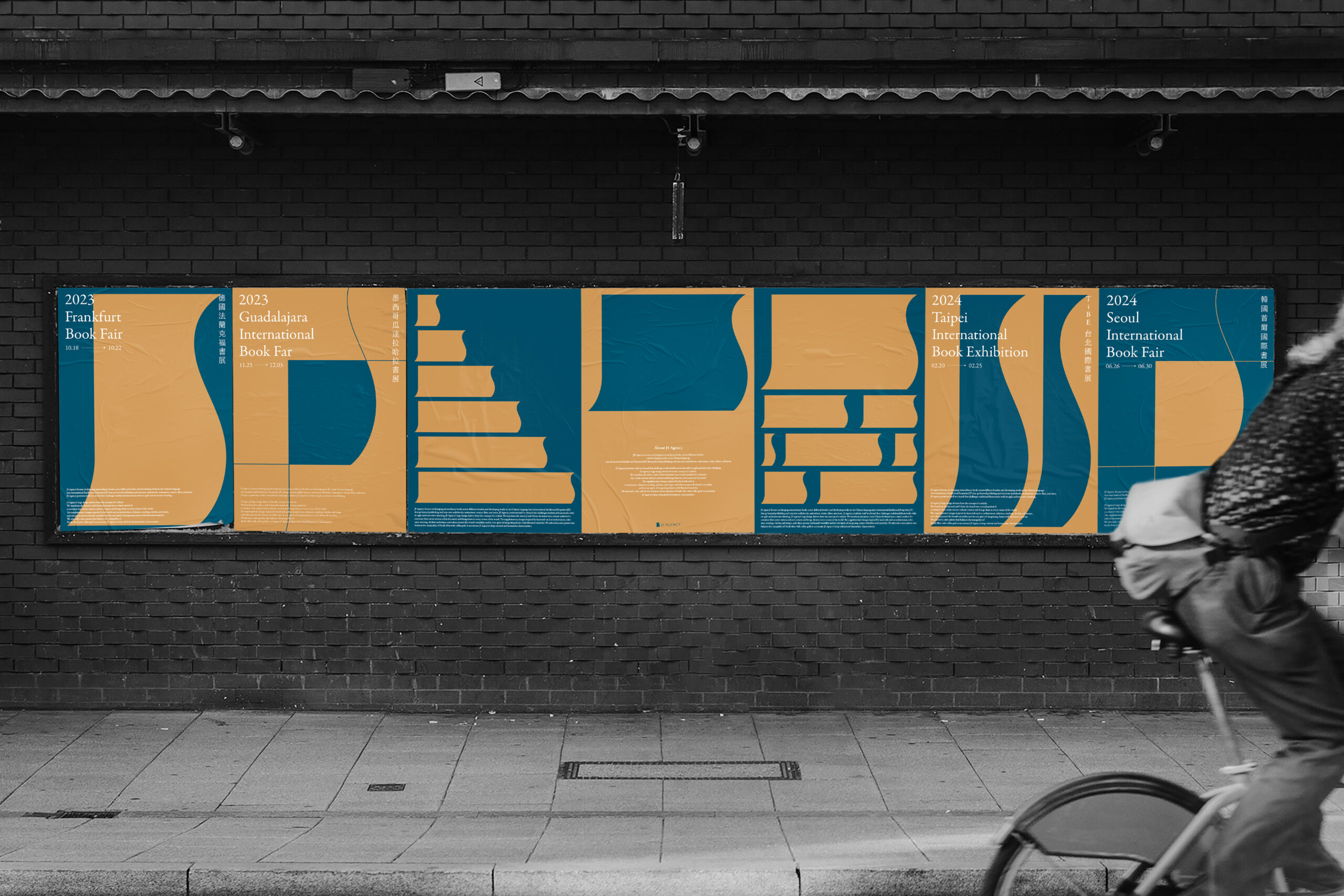
標誌設計靈感源自於「載體」,將品牌名稱 J 與 S 之間相互連結,幻化為容器的視覺意象。此容器可以乘載多元的文化內容,並分享傳遞到世界的各個角落。輔助圖形以「囊括、包容、堆疊、節奏、韻律」等關鍵字,試圖展示品牌的可塑性,象徵著捷思版權既能夠引經據典亦可不受拘束的核心精神。在色彩計畫上,我們選用了靜謐的太平洋藍色與咖啡金做調和,以凸顯捷思版權的人文氣質與深度。
JS Agency focuses on bringing extraordinary books across different borders and developing works in the Chinese language into international Intellectual Properties(IP) that go beyond publishing and turn into audiobooks, animations, comics, films, and more. JS Agency positions itself as a brand that challenges traditional frameworks with its agile and innovative thinking.
JS Agency’s logo design derives from the concept of a vehicle. We combined and transformed letters J and S from the brand into a visual symbol of a container. The logo symbolizes a container that carries various cultural contents and brings them to every corner of the world. The brand patterns inspired by keywords such as inclusiveness, tolerance, stacking, rhythm and tempo, and others present the brand’s versatility and its core spirit of integrating classics with liberated creativity. We selected a color palette that balances the tranquility of Pacific blue with coffee gold to accentuate JS Agency’s deep cultural and humanistic characteristics.
Scope
品牌識別系統設計 / 品牌延伸製作物設計 / 廣宣品設計 / 標誌設計 / 輔助圖形設計 / 海報設計
Credit
Client: JS Agency / Design Agency: Etch Design / Art Director: Bo Hao Ciou / Project Manager: Bi Zong Hu / Designer: Bo Hao Ciou
