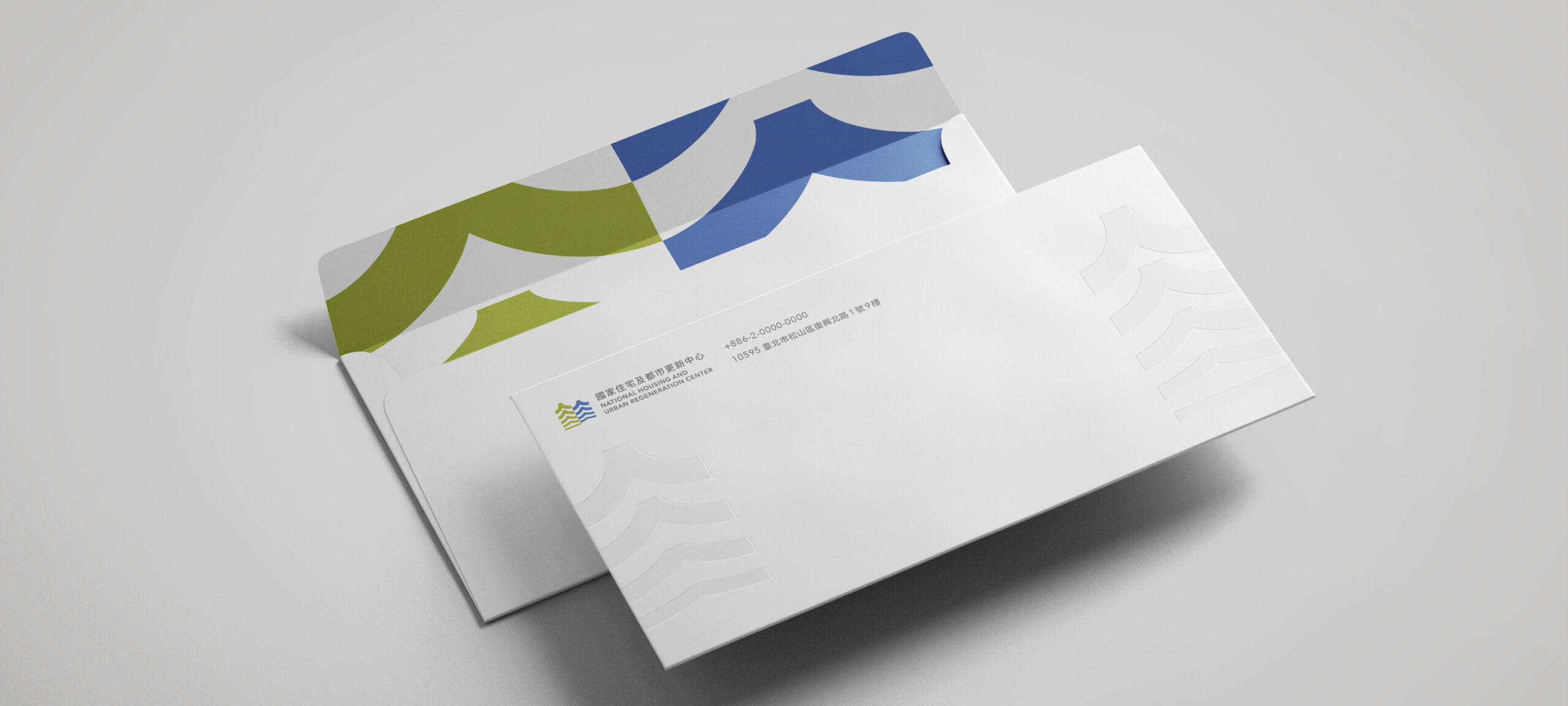
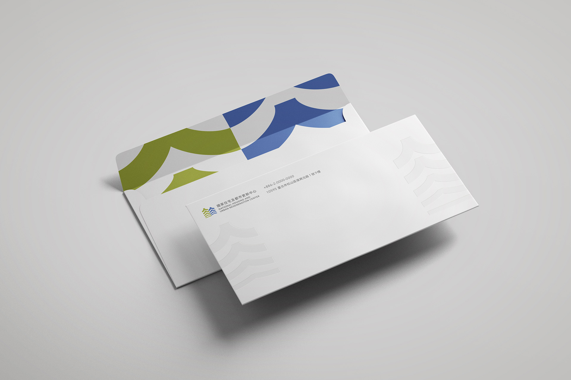
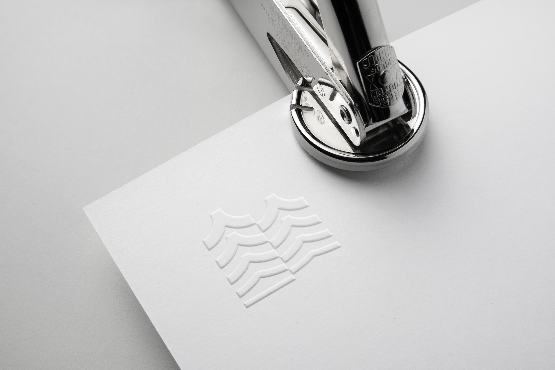
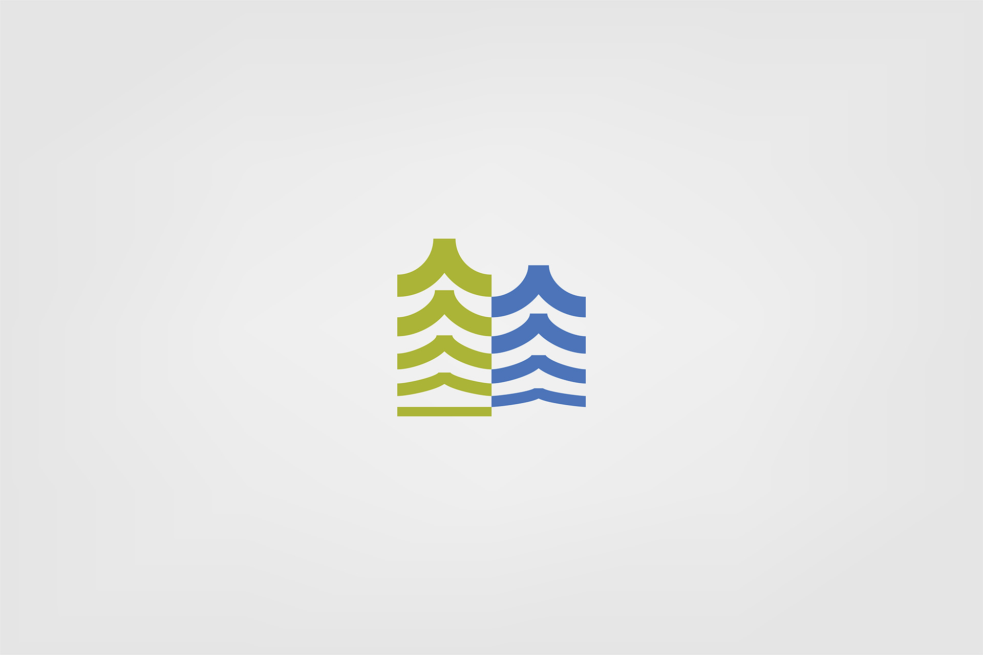
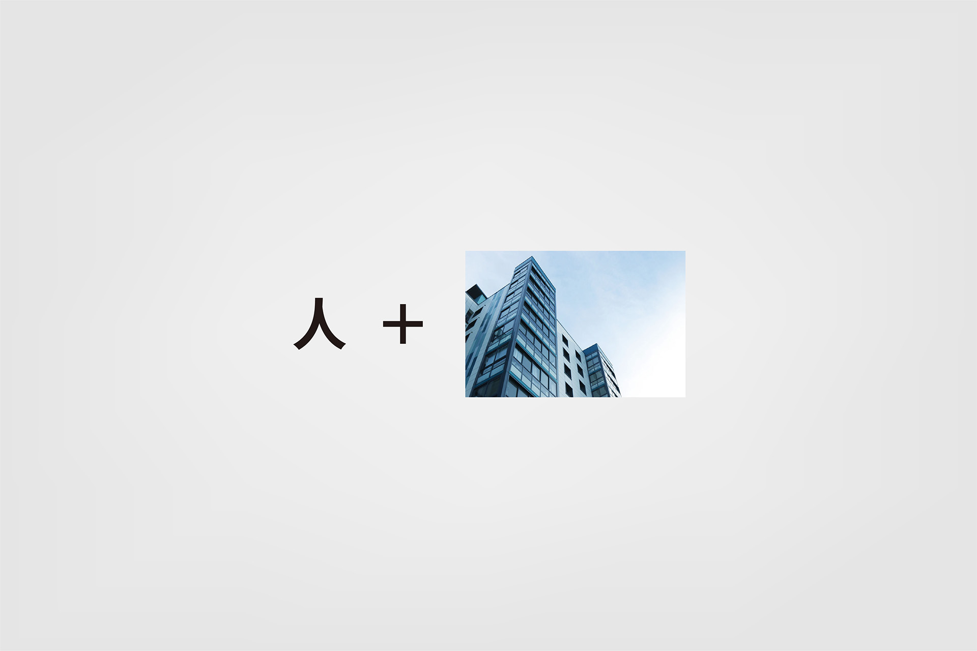
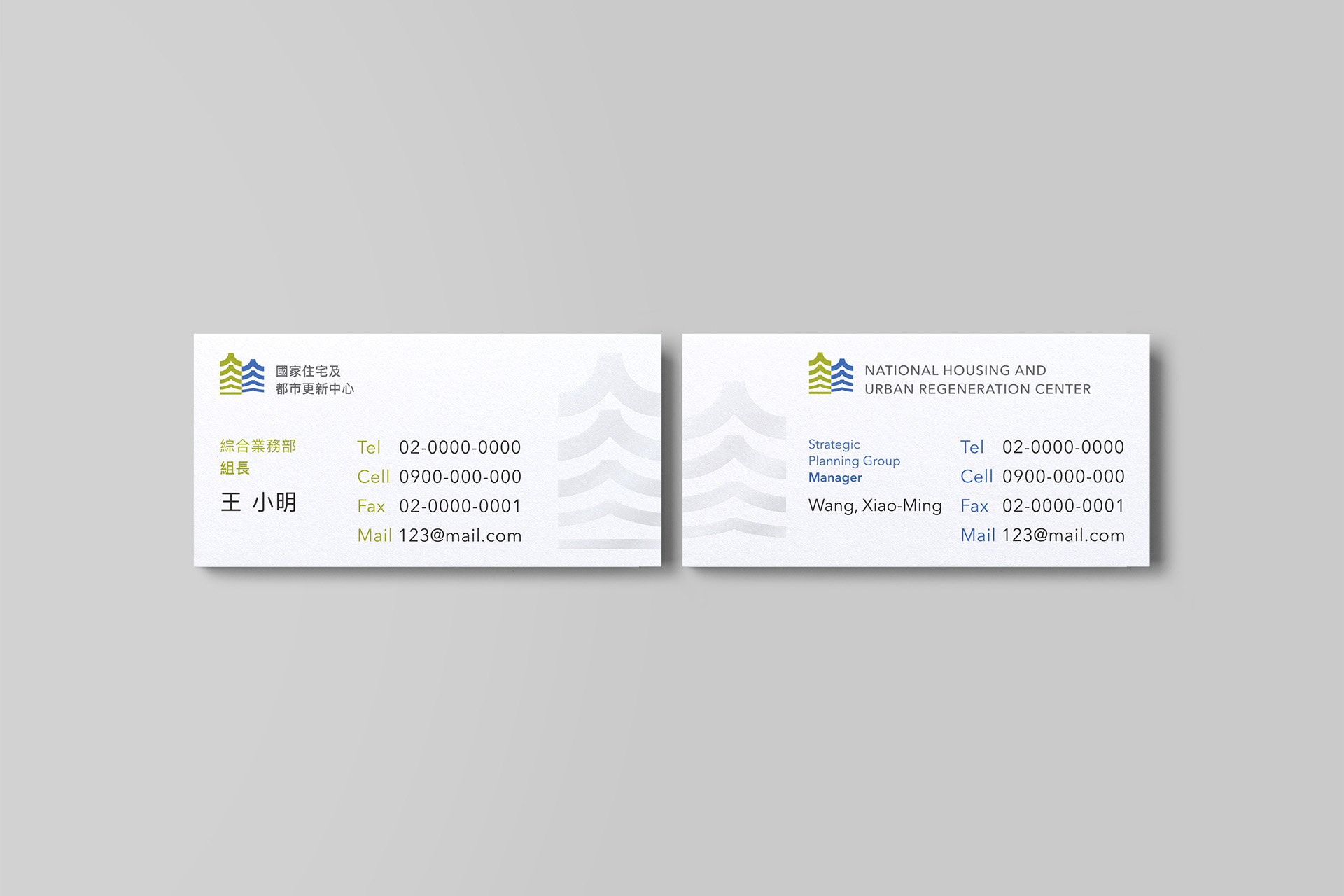
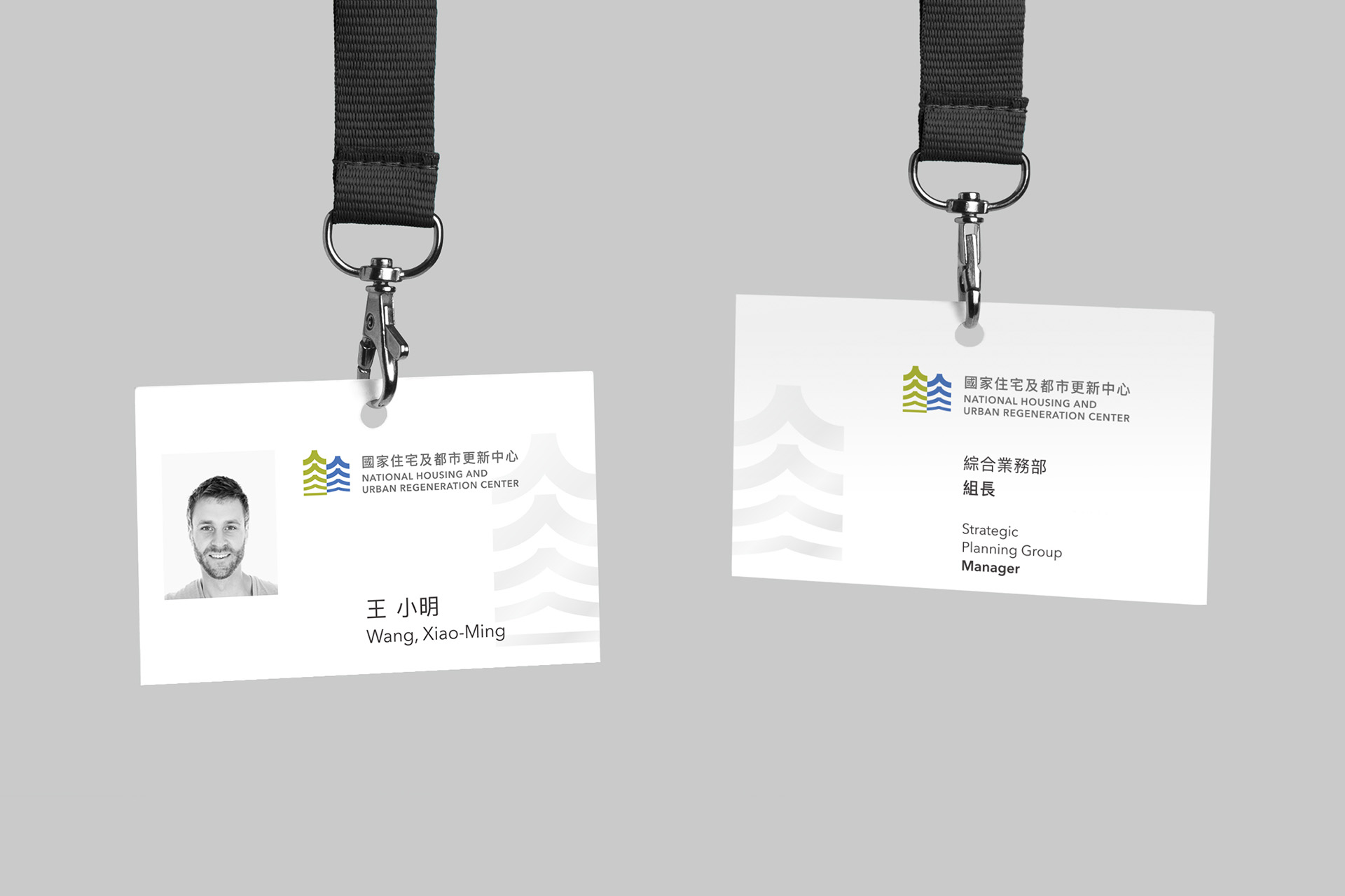
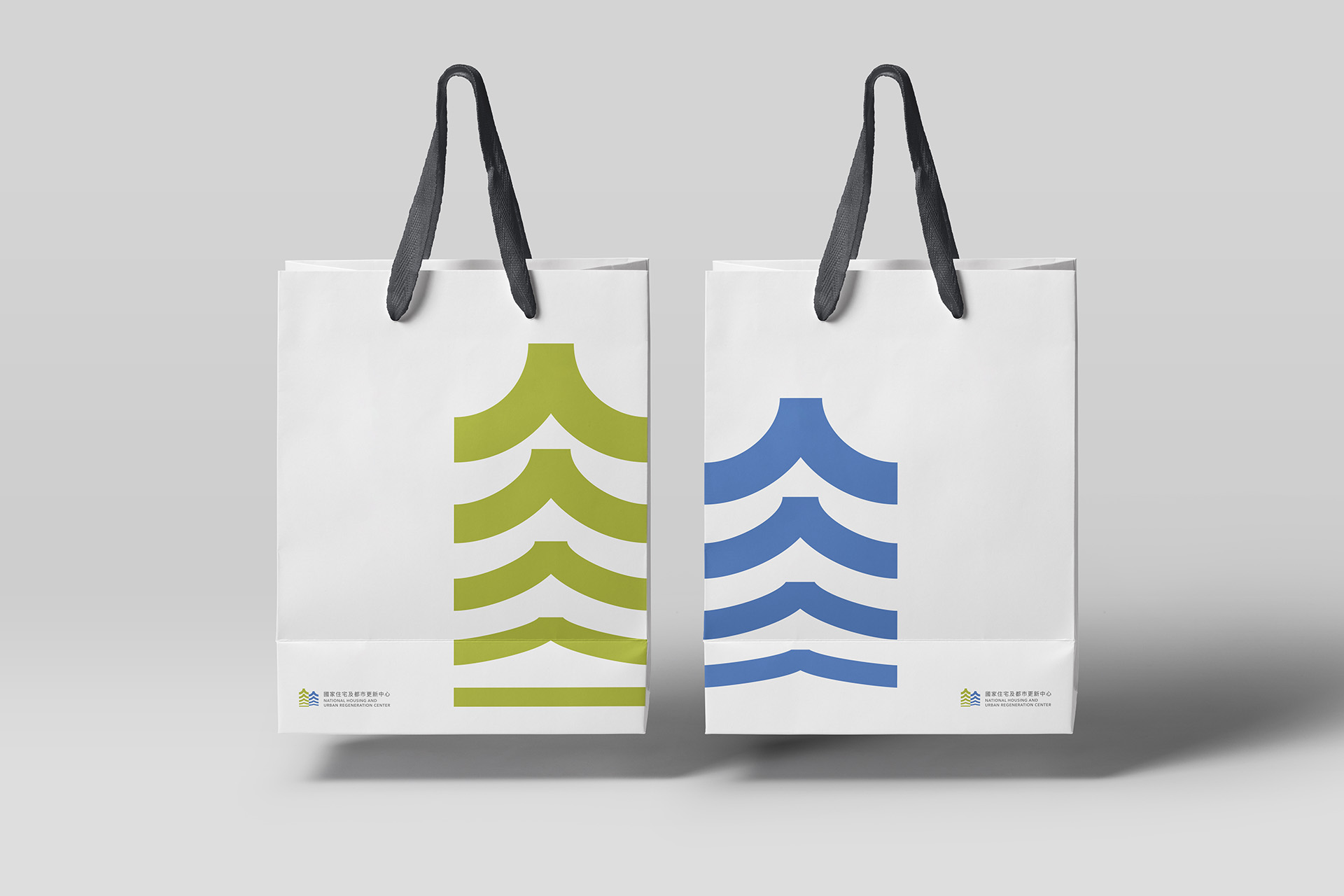
標誌上運用兩棟高樓剪影建構出「都市」,高樓皆由「平地」漸變向上形成「人」,意指人們攜手合作由平地打造出「美好的都市」;視覺動向由下往上變化有著箭頭的意象,帶出台灣都市更新不停滯的信念;整體標誌將在地性「漢字——人」與國際符碼「都市與箭頭」做結合。
The sign utilize the silhouette of two buildings to construct the form of “city”, the silhouette soaring from the ground and becoming a Chinese character “people”(人). It means people work together to build a “wonderful city” from the ground, looking the sign from bottom to top, just like a image of arrow, bringing out the belief of unstopped urban renewal. The whole sign is a combination of local (Chinese character —— People(人)) and international code (city and arrow).
Scope
品牌識別系統設計 / 品牌識別延伸製作物設計 / 標誌設計
Credit
Client: Nation Housing and Urban Regeneration Center / Design Agency: Etch Design / Designer: Bo Hao Ciou
