國立中央大學物理學系
NCUPHYS
國立中央大學物理學系在教學與課程設計方面積極創新,率先推出實驗課程改革與雙軌修課制度,加強學生在物理思辨、實作、與團隊合作方面的能力,並提供學生多元的課程選擇,以適才適性發展。
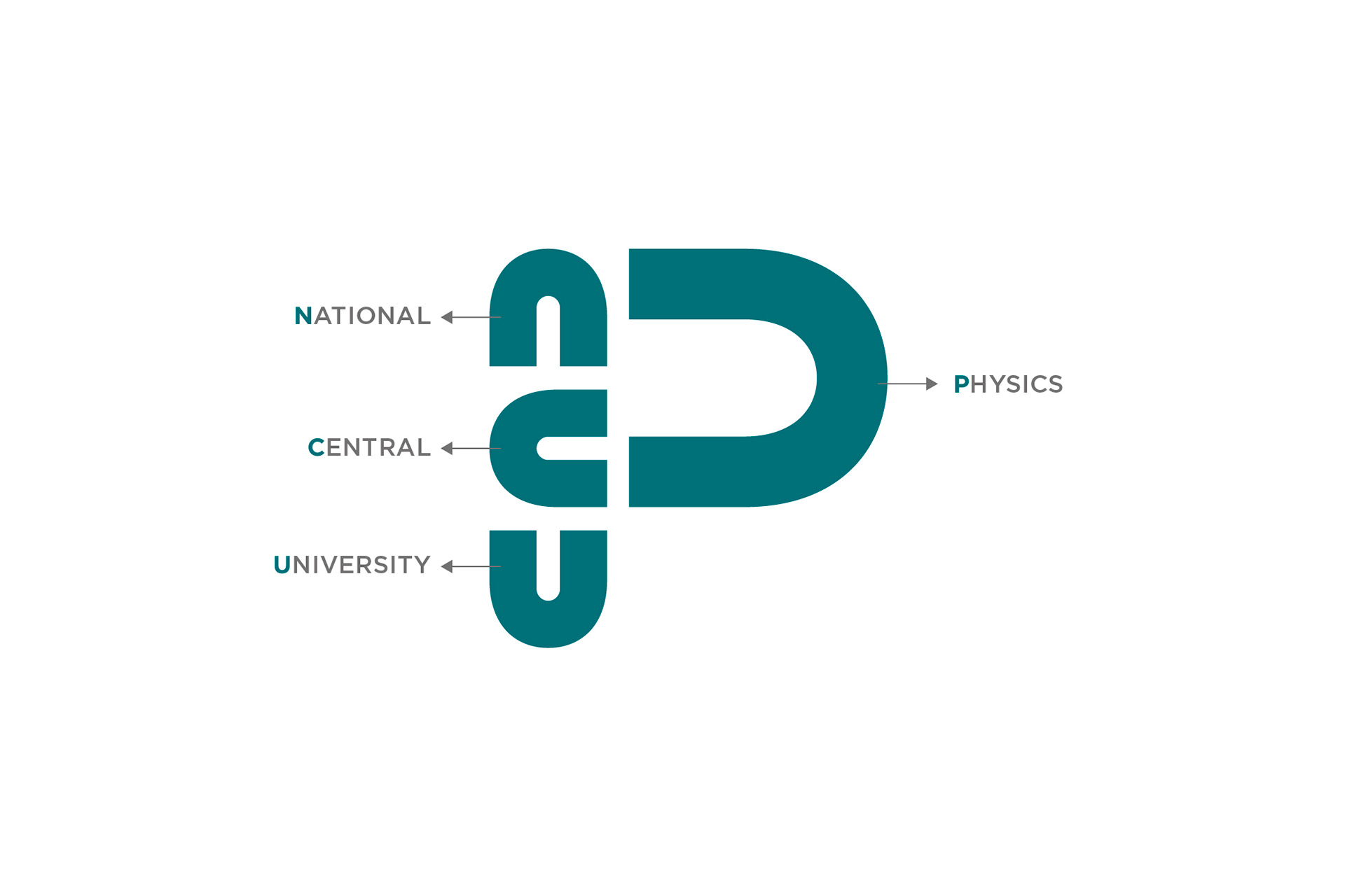
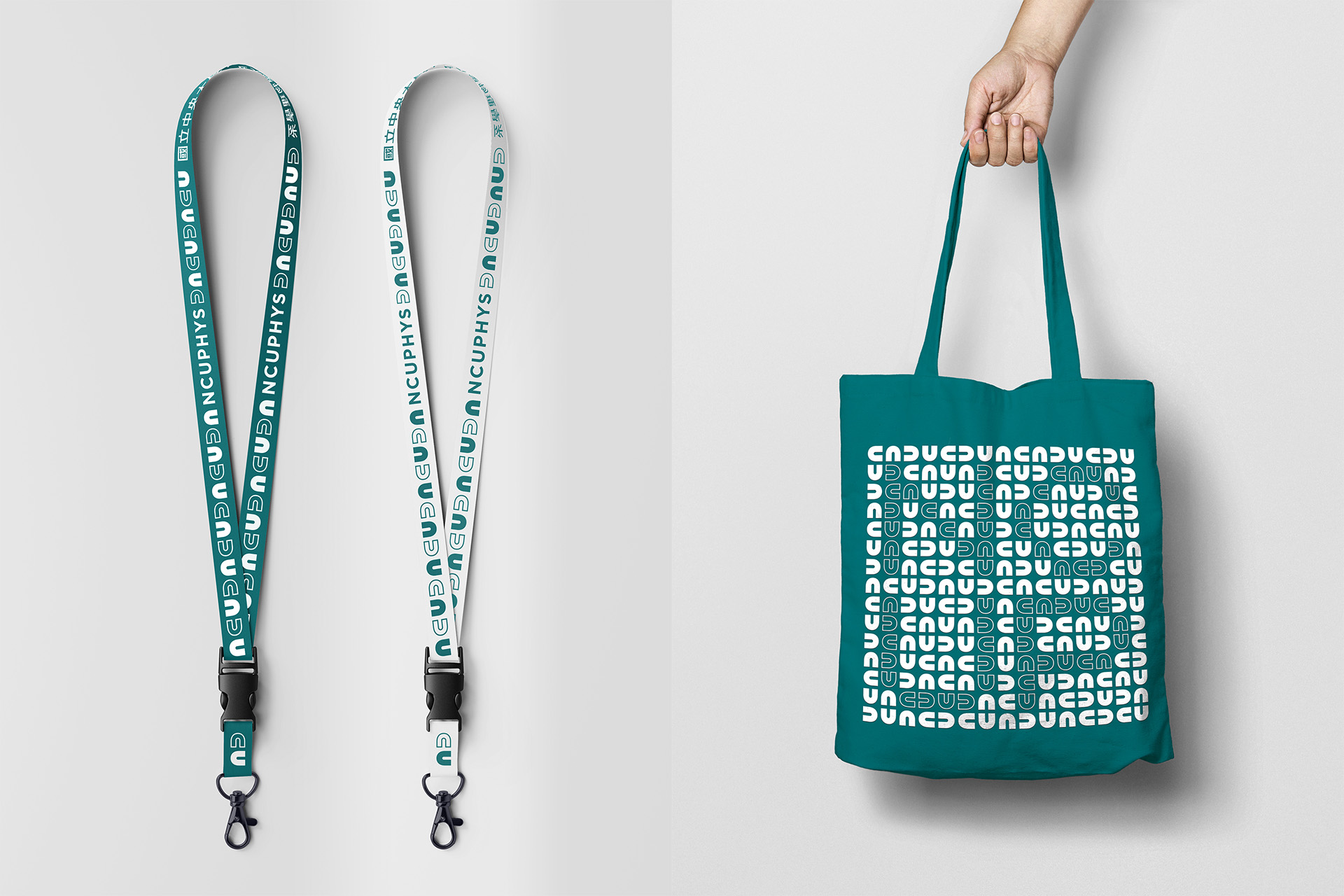
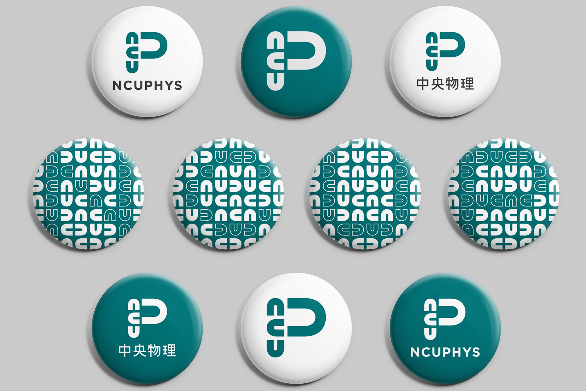
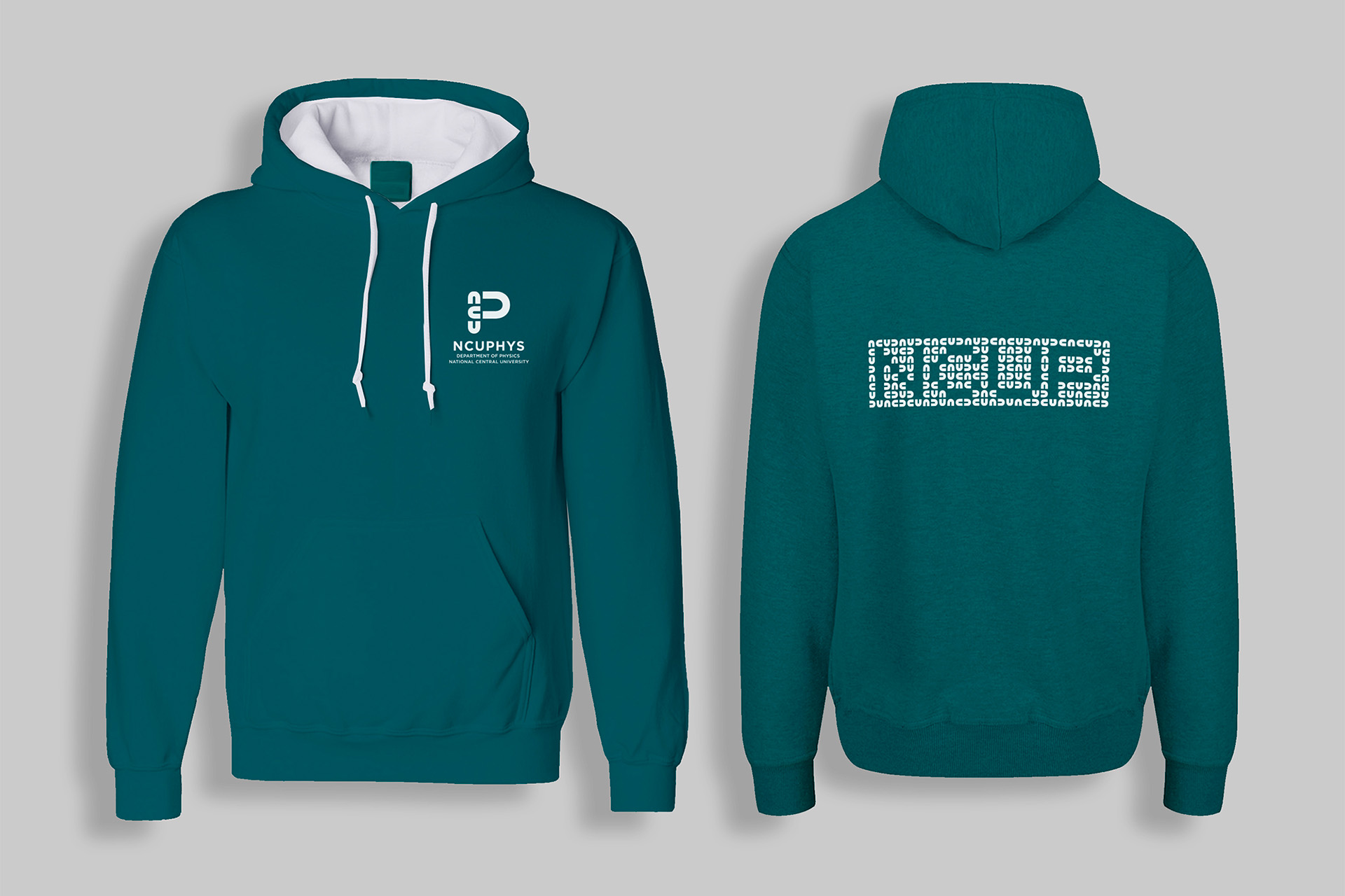
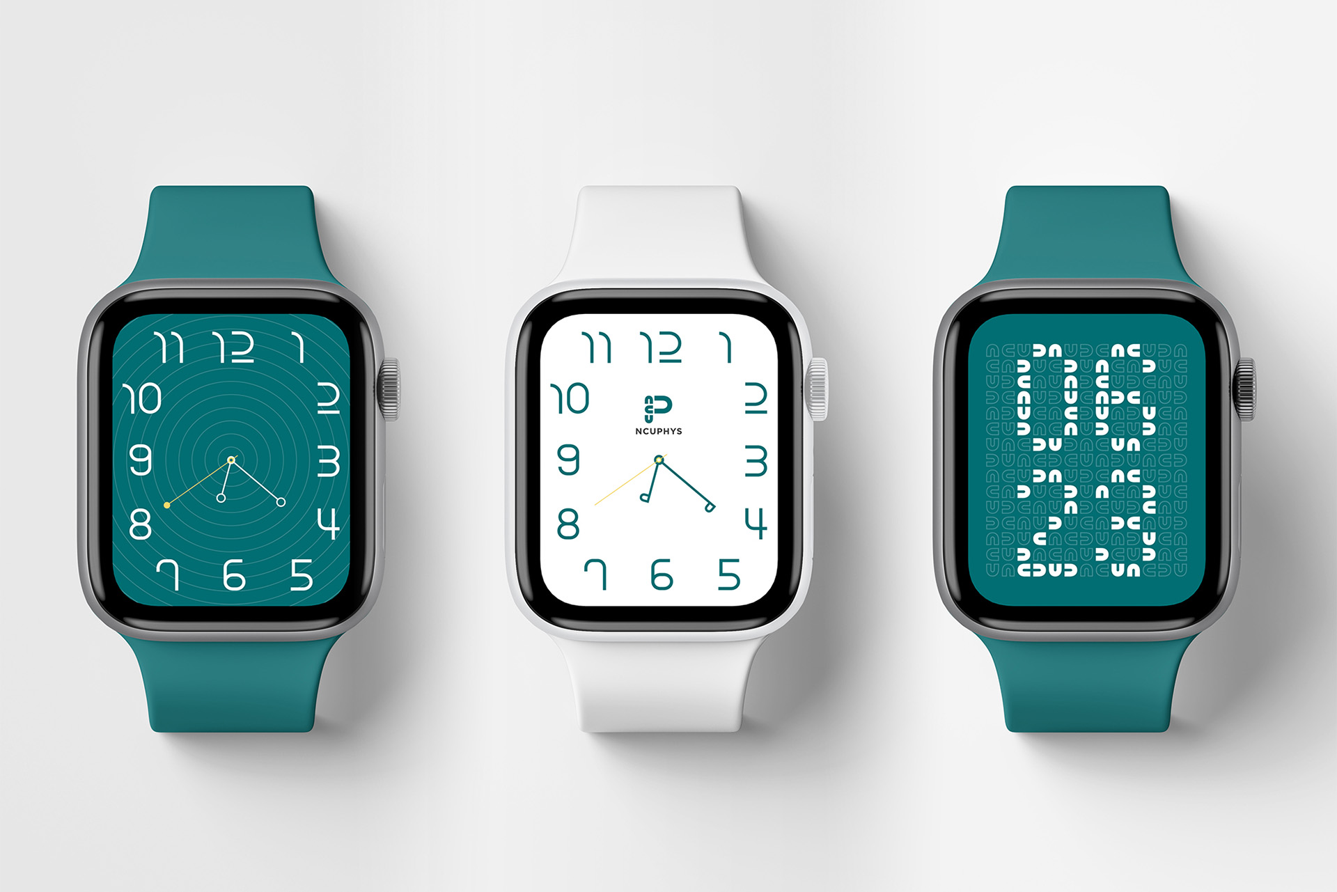
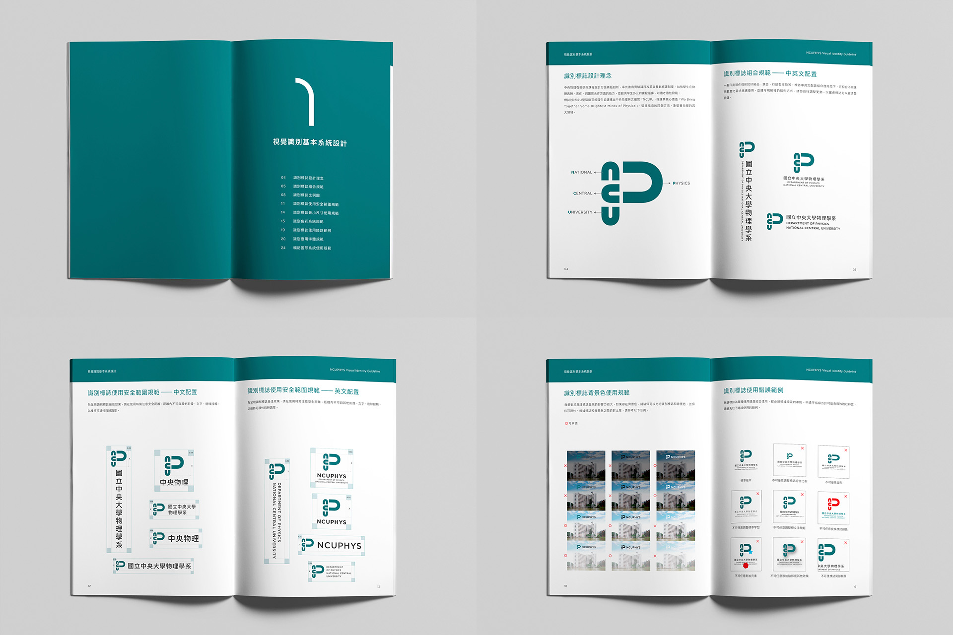
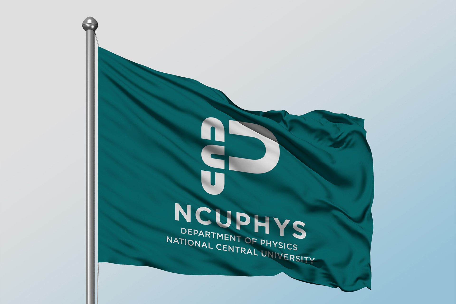
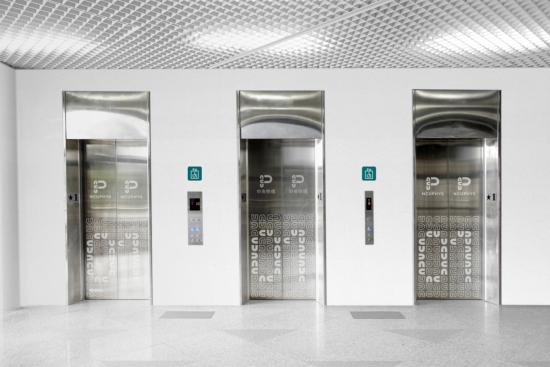
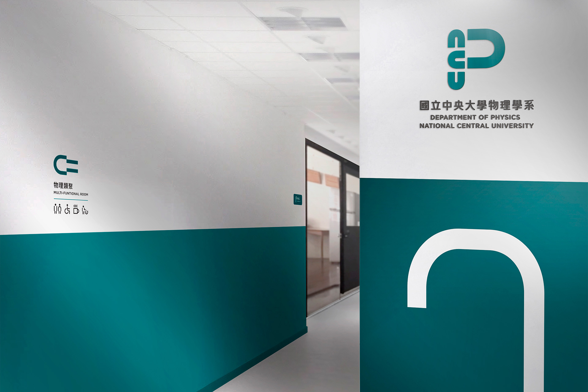
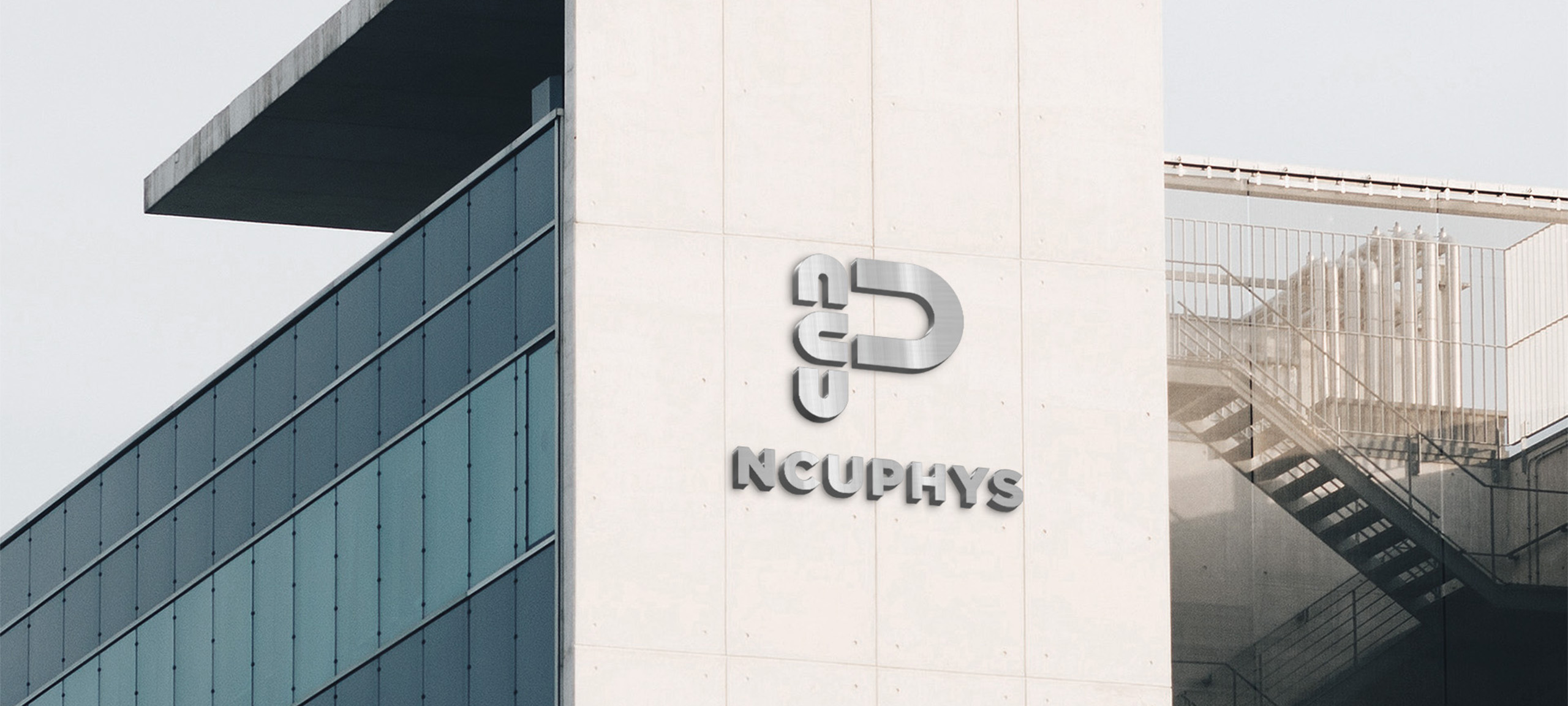
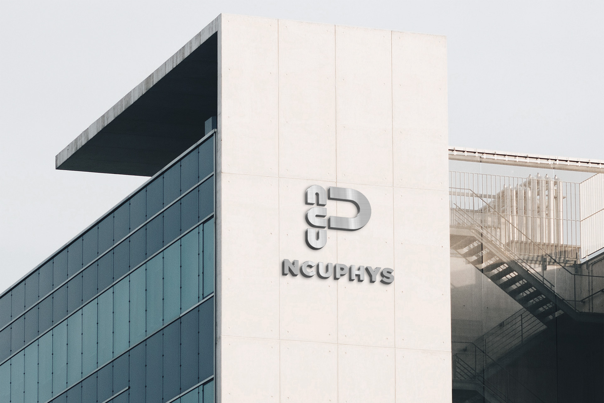
標誌設計以 U 型磁鐵互相吸引並建構出中央物理英文縮寫「NCUP」,呼應其核心價值「We Bring Together Some Brightest Minds of Physics!」,磁鐵指向的四個方向,象徵著物理的四大領域。
NCUPHYS is actively innovating on designing the course, taking the lead to roll out the reformation of lab course and bi-rail courses. In this way, it can reinforce students’ ability on physics speculative, implementation and team work, also provide diversified courses for students to adapt students interest.
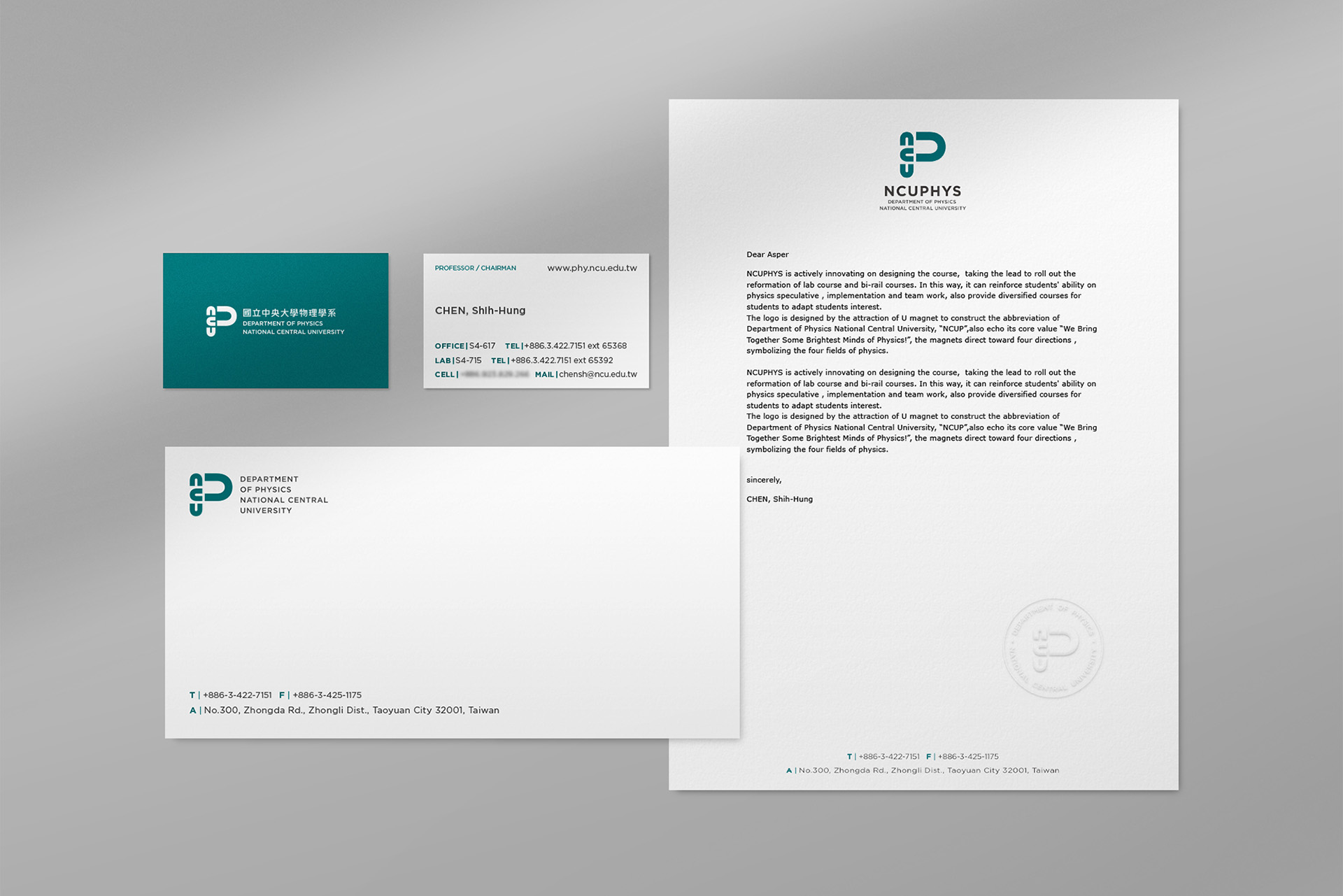
The logo is designed by the attraction of U magnet to construct the abbreviation of Department of Physics National Central University, “NCUP” also echo its core value “We Bring Together Some Brightest Minds of Physics!”, the magnets direct toward four directions, symbolizing the four fields of physics.
Scope
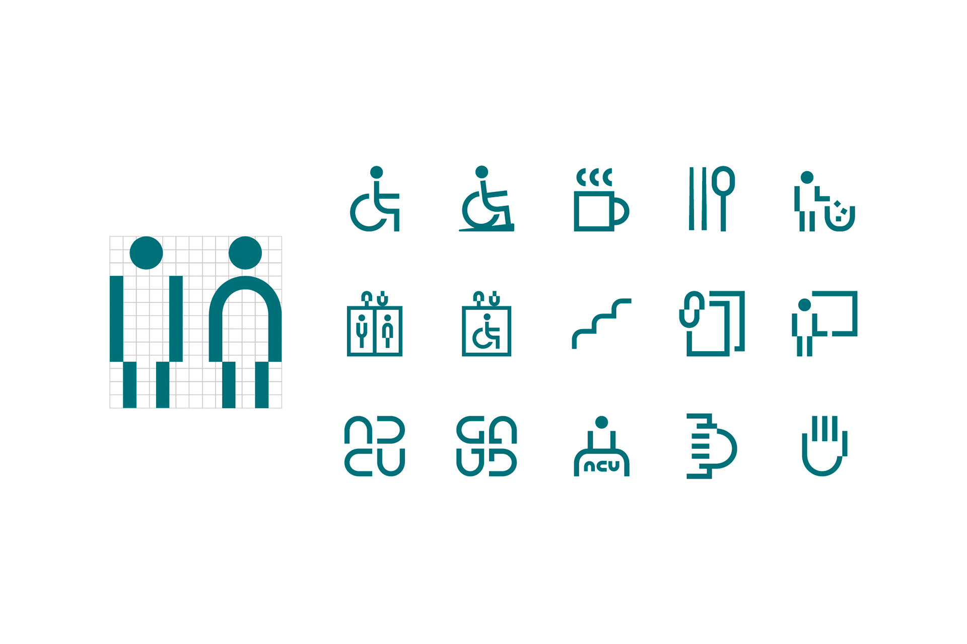
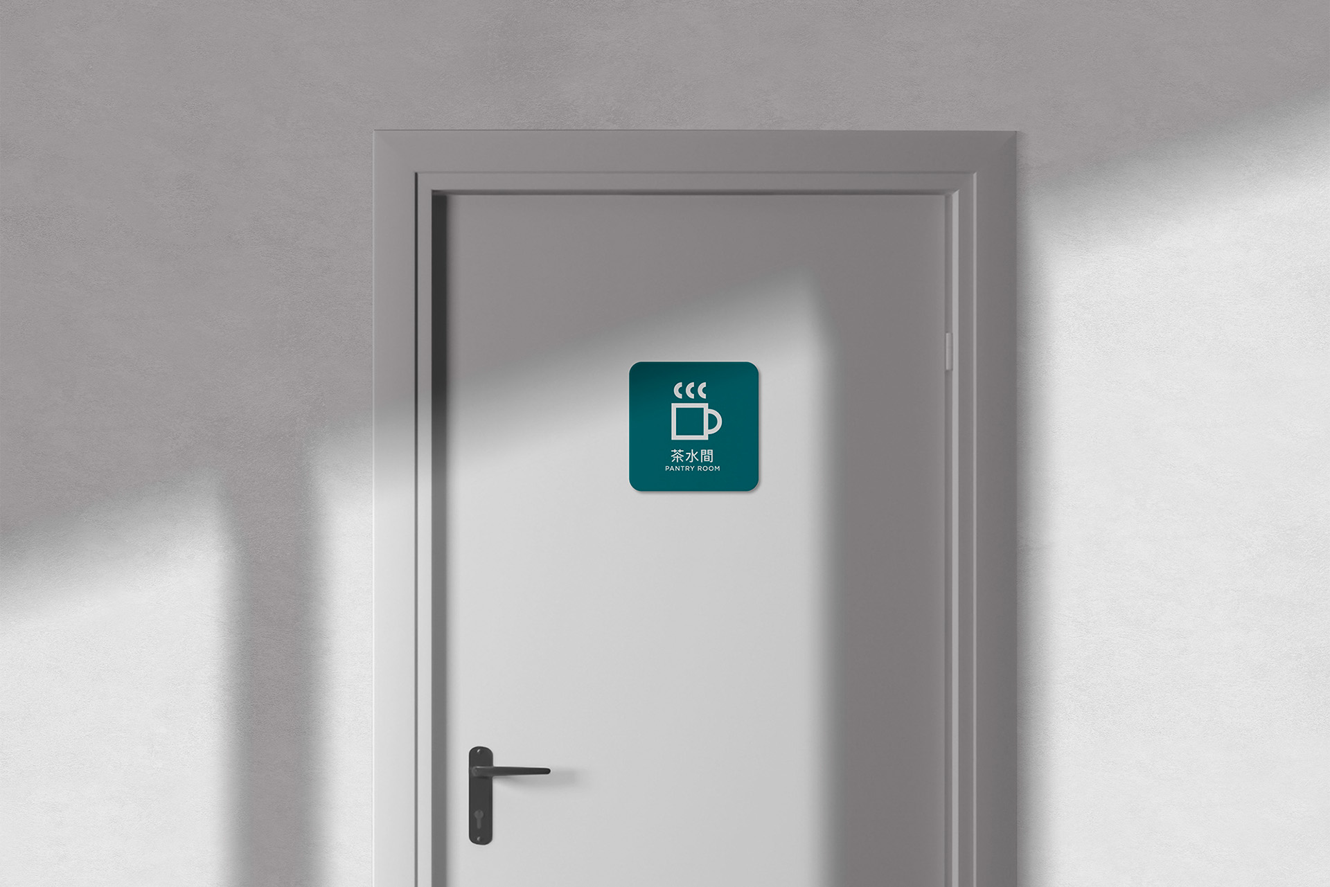
系所識別系統設計 / 系所延伸製作物設計 / 宣傳品設計 / 標誌設計 / 標準字設計 / 指標系統設計 / 空間設計 / 美術指導
Credit
Client: Department of Physics National Central University / Design Agency: Etch Design / Co-Agency : Ph design / Project Manager: Bi Zong Hu / Designer: Bi Zong Hu, Bo Hao Ciou / Interior: Phoebe Wong
